People who are crazy enough to think they can change their community are the ones who do.
Connect's ultimate goal is to reduce disease, decrease health disparities, and to close Tulsa's life expectancy gap. The program is a free support resource that tailors custom plans to qualifying North Tulsans.
My job was to create a unique, relatable, and distinctive identity that would establish trust and enable Connect community workers to nurture relationships with potential clients.
Starting with trust, Connect can break through the typical apprehensions and cynicism their potential clients have with community resources.
C H A L L E N G E
Navigating numerous constraints while creating a brand strategy and identity that would be effective within a cynical and saturated market.
O U T C O M E
I helped Connect develop a brand strategy, identity system, and basic messaging that is consistent with the brand’s values. This resulted in Connect transforming from brand new program with nothing more than a list of goals and objectives, to a full-on brand that can change someone's life.
S C O P E O F P R O J E C T
Brand Strategy
Identity System Design
Messaging
Identity System Design
Messaging

Developing the Strategy
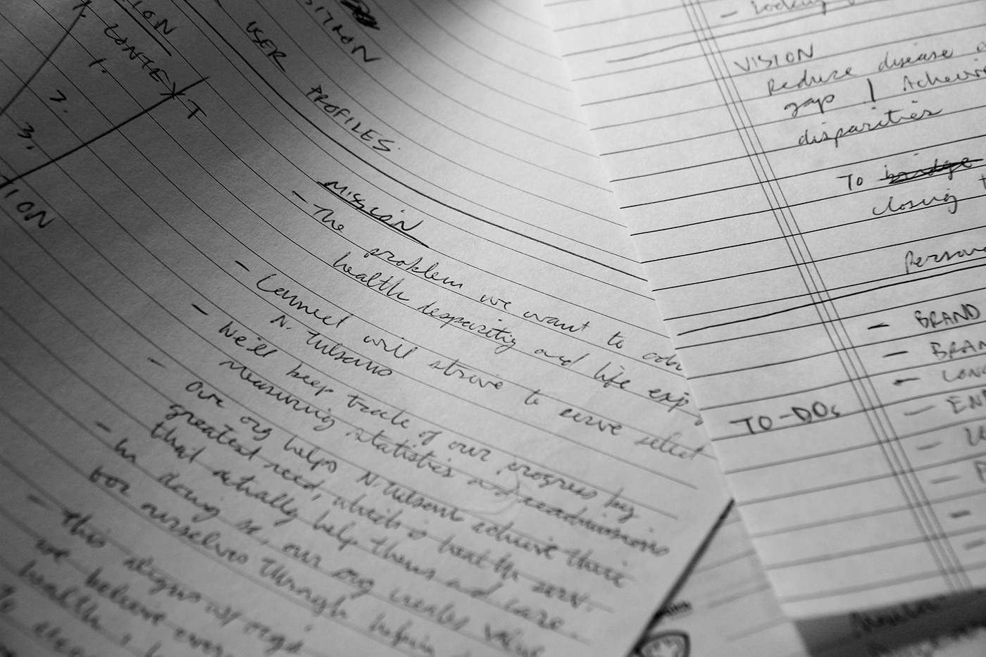
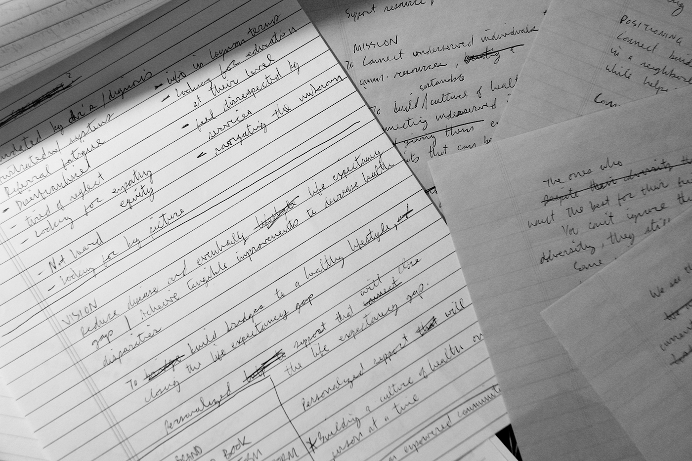
Connect was a brand new program, so we were starting from square one. Our kick-off meeting taught me the basics of the program. We discussed the goals, desires, and pain points of the program and the program's users. Then I facilitated a strategy and discovery session using my brand strategy framework. This helped us define and clarify all the core brand elements a business needs to succeed. We developed a mission, vision, values, ideal clients, brand attributes, positioning, brand personality/archetype, tag line and a basic messaging kit.

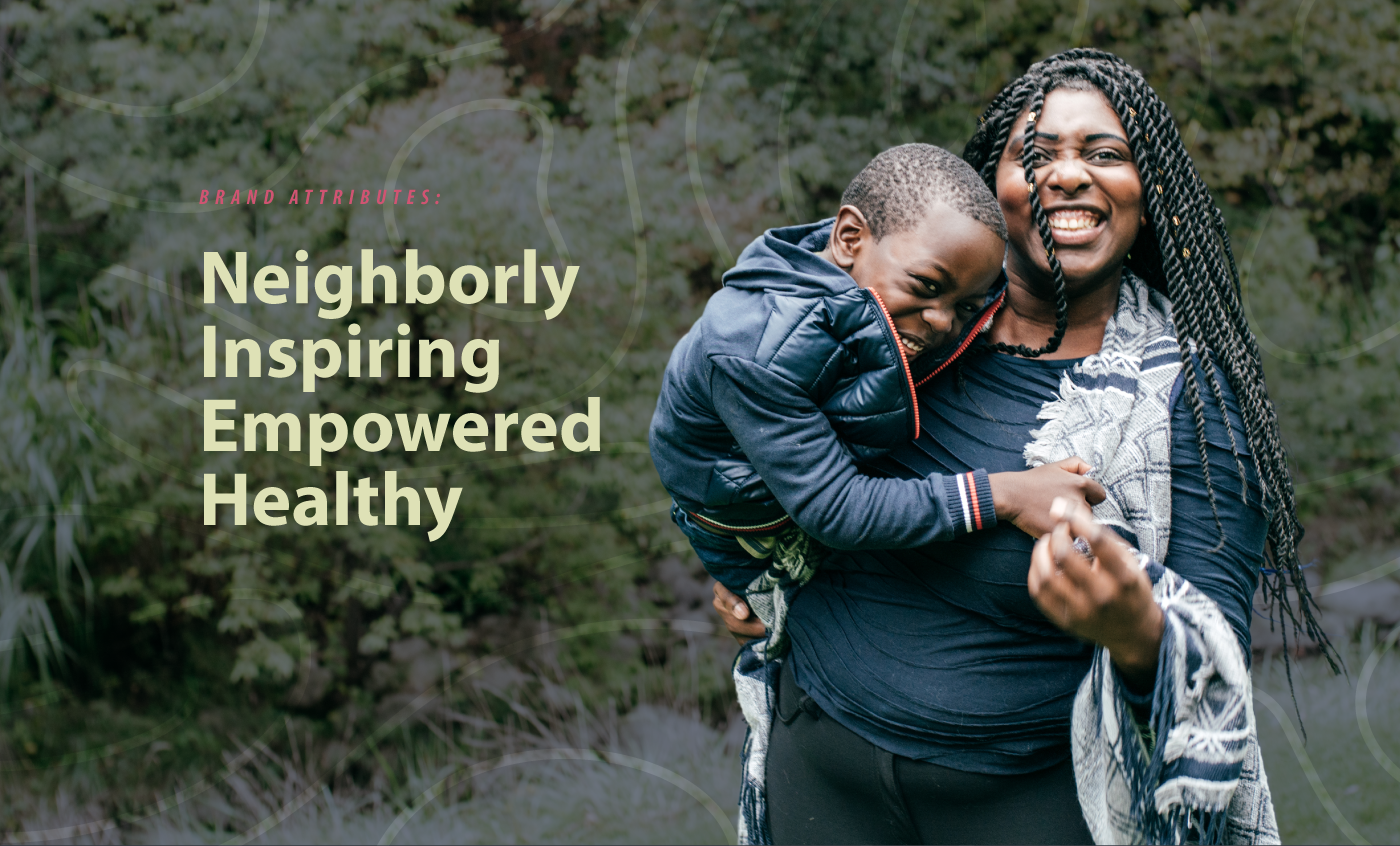
The importance of community was a common theme in focus group results. So, I relied on connectedness, friends, family, and being a Tulsan when establishing Connect's brand personality.
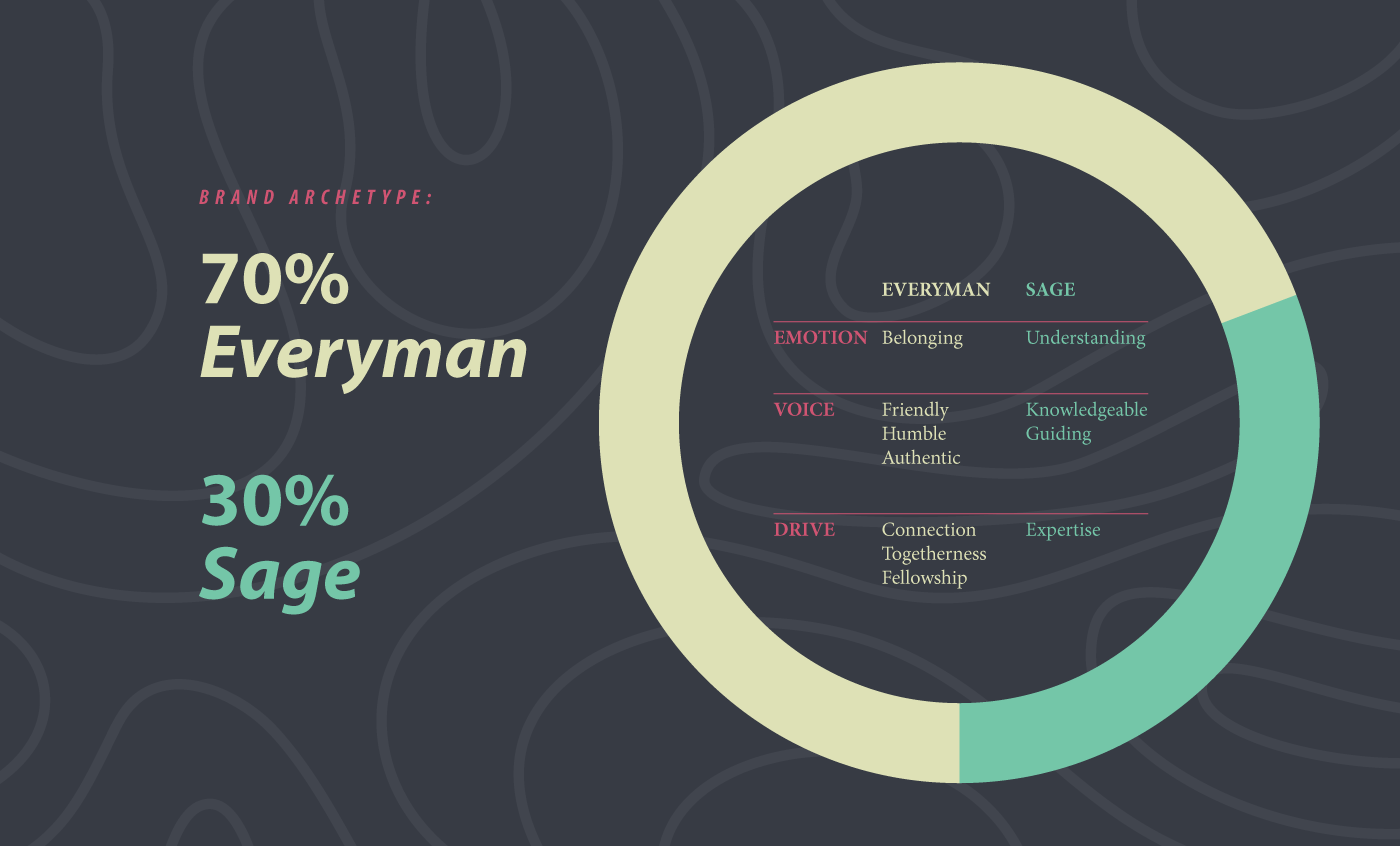
The Connect program doesn't have convenient access to creative services, so I thought it would be useful to define a brand archetype for them. The archetype is a tool for Connect employees that describes the brand personality in a way that is relatable and easy to understand. This empowers the Connect community workers to embody the brand without the need of marketing "experts" or an overblown brand guide.
Connect's brand archetype mix of Everyman/Sage juxtaposes the expertise to teach, guide, and mentor with the familiarity and charm of a native Tulsan.
Identifying the ideal user
The discovery and strategy session helped us to define the psychographics of Connect's potential clients—a tremendously valuable insight for Connect's community workers to have when attempting to build trust with client.
Connect clients must meet several qualifications to be eligible for services. This means that many of the demographics are predetermined. As a result, we decided to focus on the psychographics of qualifying clients. For example, Connect's ideal client might feels like they're carrying the weight of the world. They work hard but can never seem to get ahead. Despite being overwhelmed, they still want the best for their family and community.
Positioning
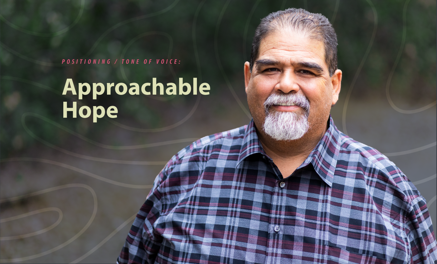
Connect's positioning can best be described as Approachable Hope.
—
Connect provides an individualized link to community resources for North Tulsans in a neighborly and inspiring way while helping them feel empowered and healthy.
— Internal Positioning Statement —
The program's ideal users were skeptical and cynical toward new services in the area. Focus group data told us that, on average, North Tulsa residents perceived Mid and South Tulsa to have better healthcare. This perception was due to Mid and South Tulsa having highly reputable hospital systems and the potential clients’ negative experiences with the care providers in North Tulsa. Fortunately, Connect is a program started by one of the reputable hospital systems that North Tulsa residents already trust. This “social proof” immediately differentiated Connect from the other services and allowed potential clients to lower their guard.
Connect’s positioning isn't only based on the trust and reputation of the hospital. The program's services are also different from similar programs in that they provide completely custom and individualized solutions for their clients. There is no one-size-fits-all approach.
Identity System Design
The insights we gained from the strategy and discovery session also informed the creation of Connect’s identity system. Through the use of stylescapes, we were able to collaboratively narrow down the visual style into a single direction.
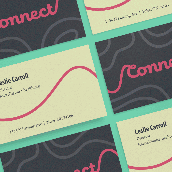
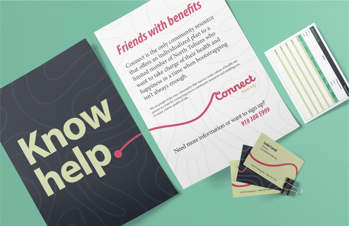
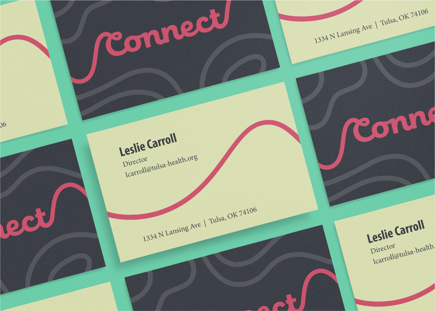
The identity system included a logo, a color palette, typography, and established a basic visual language for the brand. The overall visual style was inspired by the many types of "connections" made by the program. Not only is the program connected to a trusted hospital, but the program also connects its clients to the services they need.
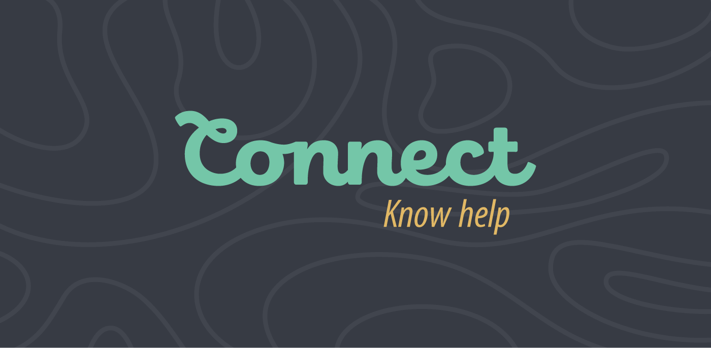
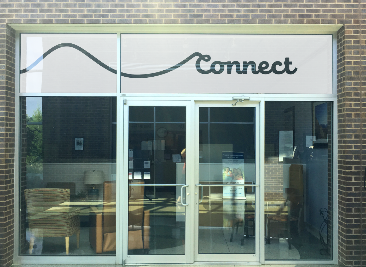
The Connect logo is a simple word mark set in a thick script with every letter connected. The C is customized with a loop to add some character, flair, and to give the mark an extra touch of distinctiveness.


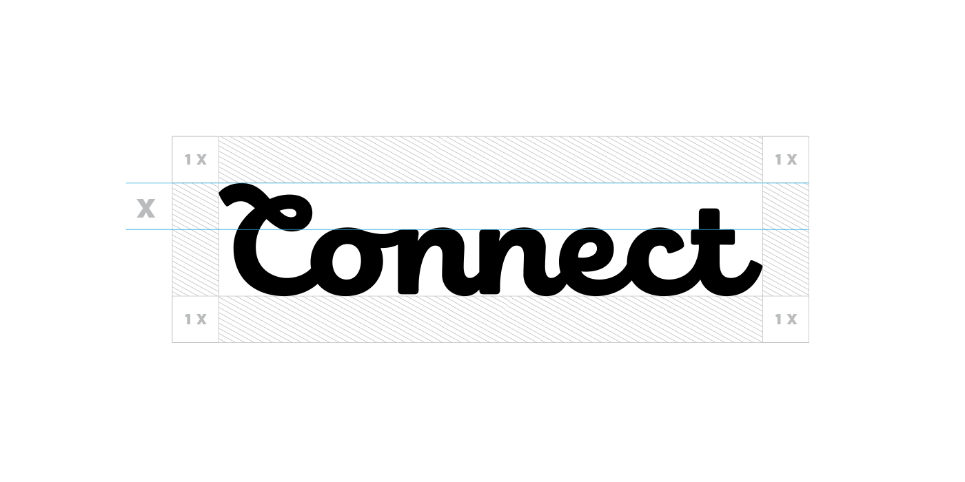
Carefully extending strokes from the word mark created opportunities to further the “connected” concept and added some playful flexibility to the mark.
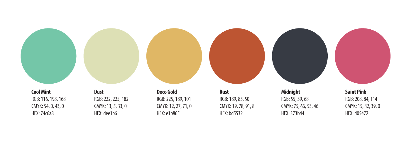
When it came time to establish a color palette and photography style, we again decided to keep it local.
Connect’s color palette softens and customizes the colors from Tulsa’s new flag, then adds two very strong colors for distinctiveness. Photography was directed to include scenes and backgrounds of Tulsa, and any portraits were to preferably be actual Connect clients.
Messaging
With the new brand archetype established, I created a simple messaging kit that would compliment the new visual identity. The kit included: Mission, Vision, Values, tagline, anthem, internal positioning statement, differentiation statement.
—
Connect is the only community resource that offers an individualized plan to a limited number of North Tulsans who want to reclaim their health and happiness in a time when bootstrapping isn't always enough.
— Differentiation Statement —